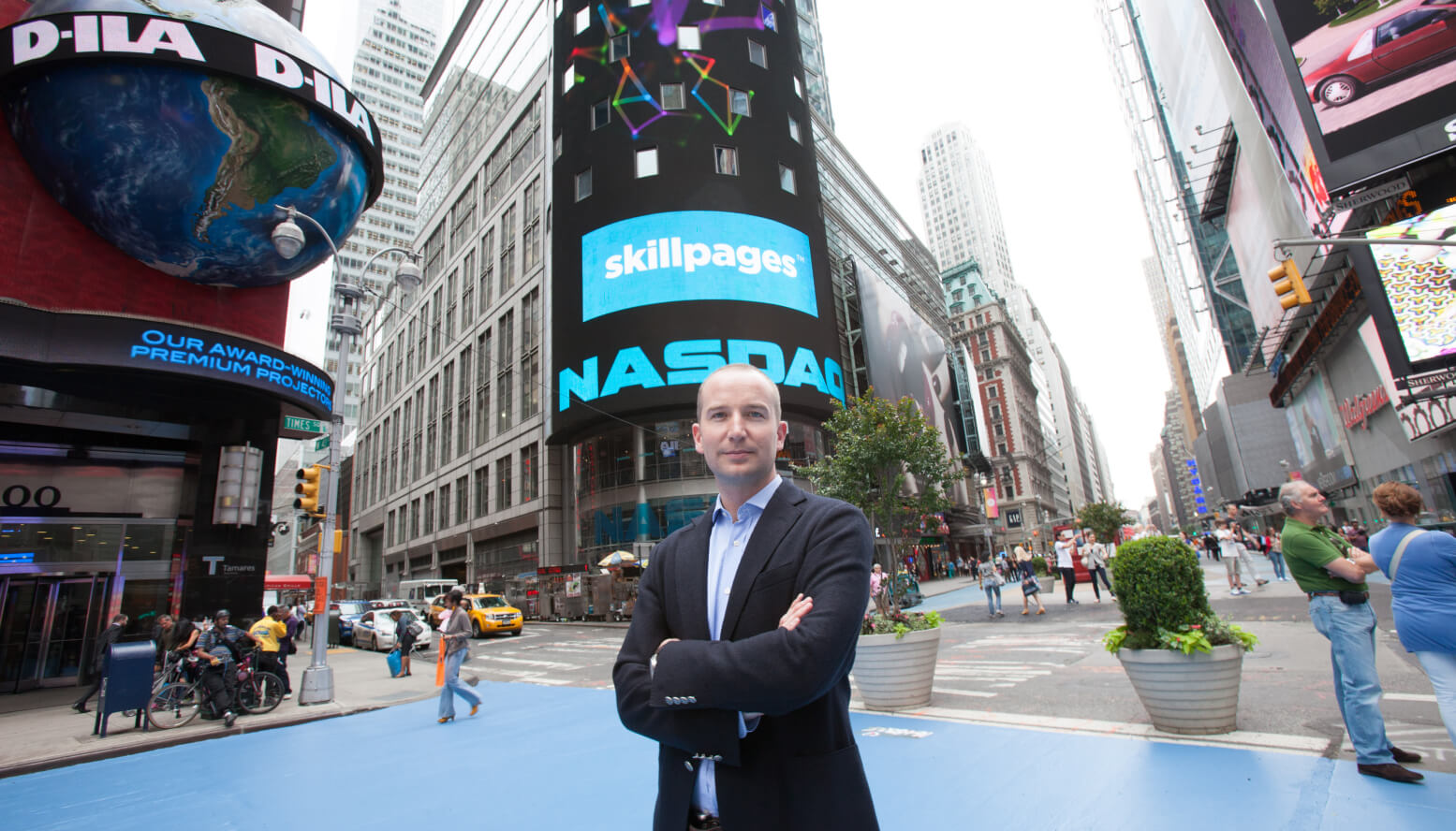
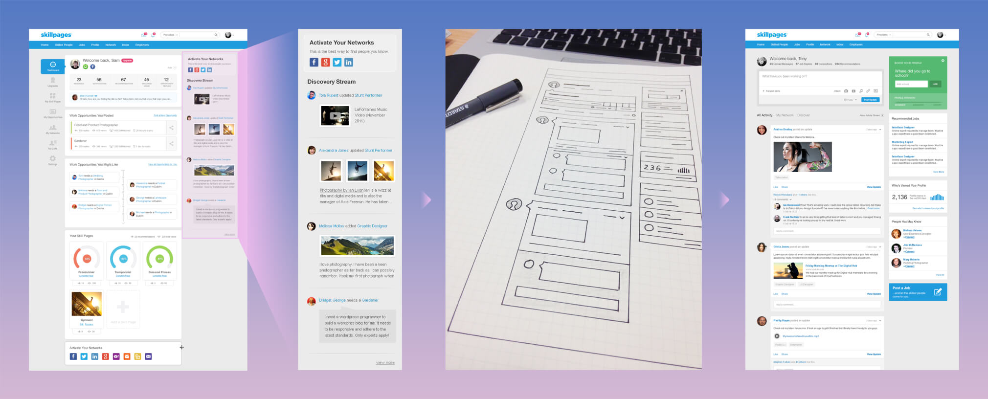
Founded by entrepreneur Iain Mac Donald in 2009, SkillPages was a platform for helping people with skills get found by the people who needed them and had over 26 million members. Based in Blackrock, the high-growth startup had funding of over €18 million from Iain, who sold his previous company, Perlico, to Vodafone for €80 million in 2007 as well as from Michael Smurfit and others. A few weeks after I started in May 2012 we had kicked off a complete overhaul of the web and mobile platform. With a small design team and tight time constraints we leveraged our dedicated community team and our ever increasing user-base to glean as much information as we could about our users and their needs. "SkillPages 2" or "SP2" involved close collaboration with the CEO and the Head of Product, Stephen Forbes, to achieve the design vision through balancing business objectives with those user needs. I led the project and six months and countless red bulls and pizzas later we delivered an entirely new SkillPages to the world.
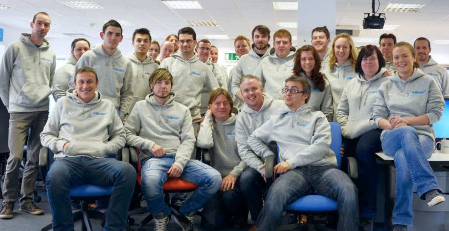
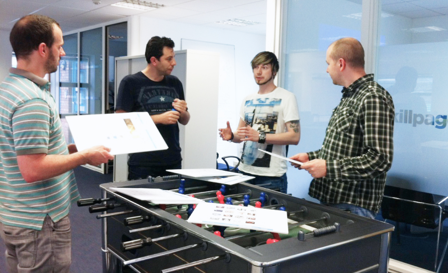
The SkillPages team was a small but focused group of probably some of the most talented people I've ever worked with. The design team was also small but grew as the project progressed.
In the four years since its inception SkillPages had already gone through an early rebrand and the platform and overall style was suffering somewhat from an identity crisis. A lack of dedicated in-house UX skills and an accumulated design was also beginning to cause navigational problems leaving content and features difficult to find. Additionally, the design was based heavily on the quickly dating Web 2.0 style of heavy shadows and gradients, playful icons and large rounded corners. In summary, the design style and usability of the platform was a far cry from where it needed to be to compete at the level expected.
The SkillPages engineering team accounted for two thirds of the company and had created an incredible world-class, scalable platform. It was important to include all of the dev teams from the outset and keep the design process open and transparent. This was even more important than usual given I was just in the door and had not had the chance to build trust with any of the engineering team or wider SkillPages team. The design team conveyed the message, "A stellar design to match stellar code." Even though some of the proprietary functionality did initially cause UX issues and friction at the beginning, close relationships with the engineering teams meant we quickly worked through any issues.
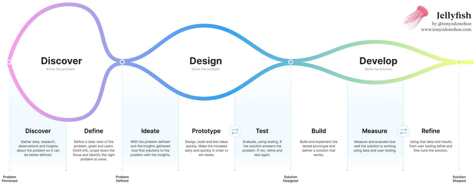
The main goal was to overhaul the existing platform which was technically advanced but difficult to use and lacking a cohesive style and personality. It was clear there was an opportunity to bring the features and functionality through to the user in a way they were much easier to use. But, that opportunity had to be accomplished fast, to the highest standards and with limited design resources. With that in mind a structured approach and way of working was essential. I applied the three stage approach below to both the overall project and individual phases of the project.
With a small design team and tight time constraints, we leveraged our dedicated community team and our ever increasing user-base of five million to glean as much information as we could about our users and their needs. "SkillPages 2" or "SP2" involved close collaboration with the CEO, Iain Mac Donald, and the Head of Product, Stephen Forbes, to achieve the design vision through balancing business objectives with those user needs.
We tried to balance qualitative and quantitative methods during discovery:
During the early discovery stage of the project we confirmed the perceived platform problems but also identified more:
Delivering the message that our design mission was to marry a stellar visual layer to the already incredible code and work the engineering teams had already done was an important first step. Equally important was ensuring that the design process remained open, transparent, and inclusive. We embraced the mindset that the SkillPages visual layer belonged to the entire team, extending beyond the confines of the design team alone. To reinforce this positive outlook, we organised collaborative design and co-creation workshops, provided regular all-hands updates, and adopted an open desk policy, inviting anyone from the wider team to drop by and discuss any aspect of the platform or design at any stage of the project.
The collaborative design workshops with our engineering colleagues proved to be indispensable. Leveraging their wealth of knowledge, we managed to steer clear of potential pitfalls and fostered brilliant ideas that ultimately found their way into the final deliverables. We were also fortunate to have incredibly skilled front-end developers within the engineering team who seamlessly merged with the design team for the duration of the project. As the new design system and design language began to take shape, they actively contributed to the design and user experience aspects, leading to an increased focus on designing directly in the browser for many areas.
Although our resources and time were limited, we firmly believed that user testing should always be prioritided, regardless of constraints. With that in mind, we employed the following methodologies to validate and refine our ideas:
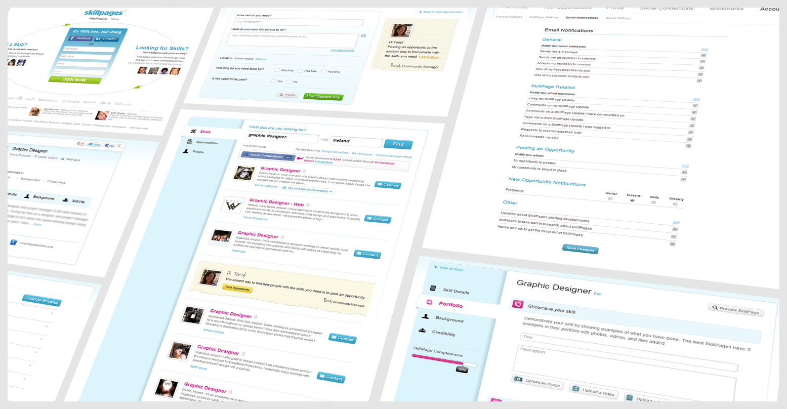
Based on the feedback we received during discovery, it became evident that the current platform was challenging to use and navigate. To address this, we adopted the "Don't Make Me Think" methodology, focusing on creating a simplified design and a structured component library. We also improved the site's architecture and navigation to enhance usability.
In our redesign efforts, we aimed to streamline and flatten every aspect. We eliminated the outdated remnants of Web 2.0 and replaced them with a more refined and elegant aesthetic. Emphasising clean design principles, we incorporated generous white space throughout the visual layer. The end result was a visionary design that surpassed the industry standards of 2012.
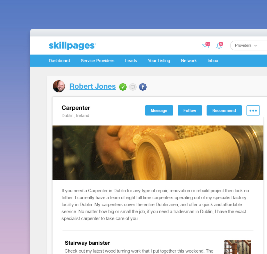
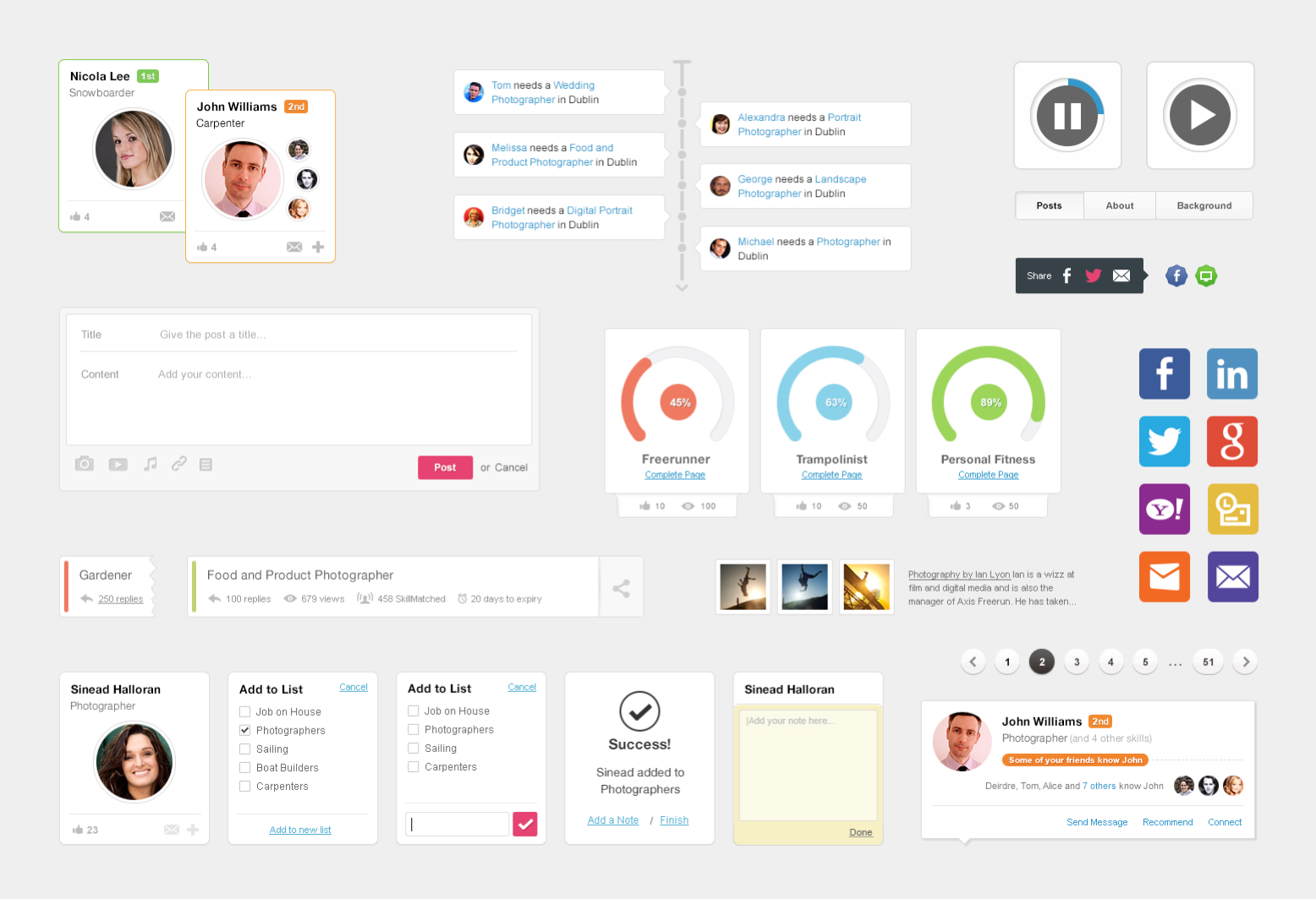
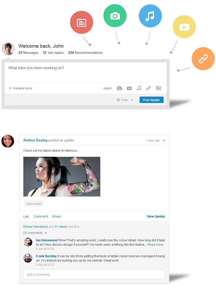
The "skill" pages served as the heart of the SkillPages platform, but user feedback indicated that they were restrictive and didn't effectively showcase skills. Encouraged by positive feedback received during paper prototyping, we took the terms "skill" and "pages" quite literally. We transformed each skill into its own dedicated page, enabling owners to share updates, photos, videos, and links. Additionally, users could now recommend and follow individual skills, among other features.
This innovative approach resonated well with our members, resulting in a significant surge of user-generated content after the launch. The new individual skill pages provided a powerful platform for users to showcase their abilities, foster connections, and expand their networks.
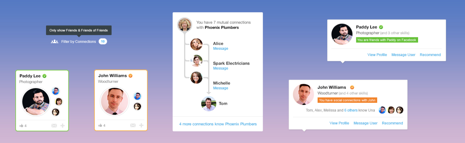
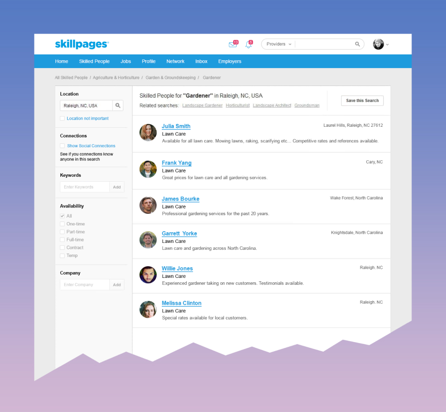
During the discovery phase we discovered that the search results experience for many users was negative and impersonal. We delivered a more personal layout for search results which we hoped would help users feel like they were connecting with real people while at the same time fostering trust by showing mutual connections upfront.
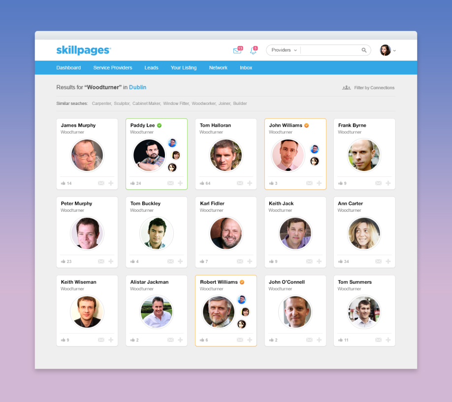
Mutual connections was a vital part of the core functionality of the SkillPages platform and was inherent in all of the functionality. This wasn't capitalised on in the initial platform but it was something we paid much more attention to in SkillPages 2.
The visual layer of SkillPages was a key factor in this overhaul. Along with usability one of the primary goals was to create a stunning visual layer to differentiate the platform from competitors.
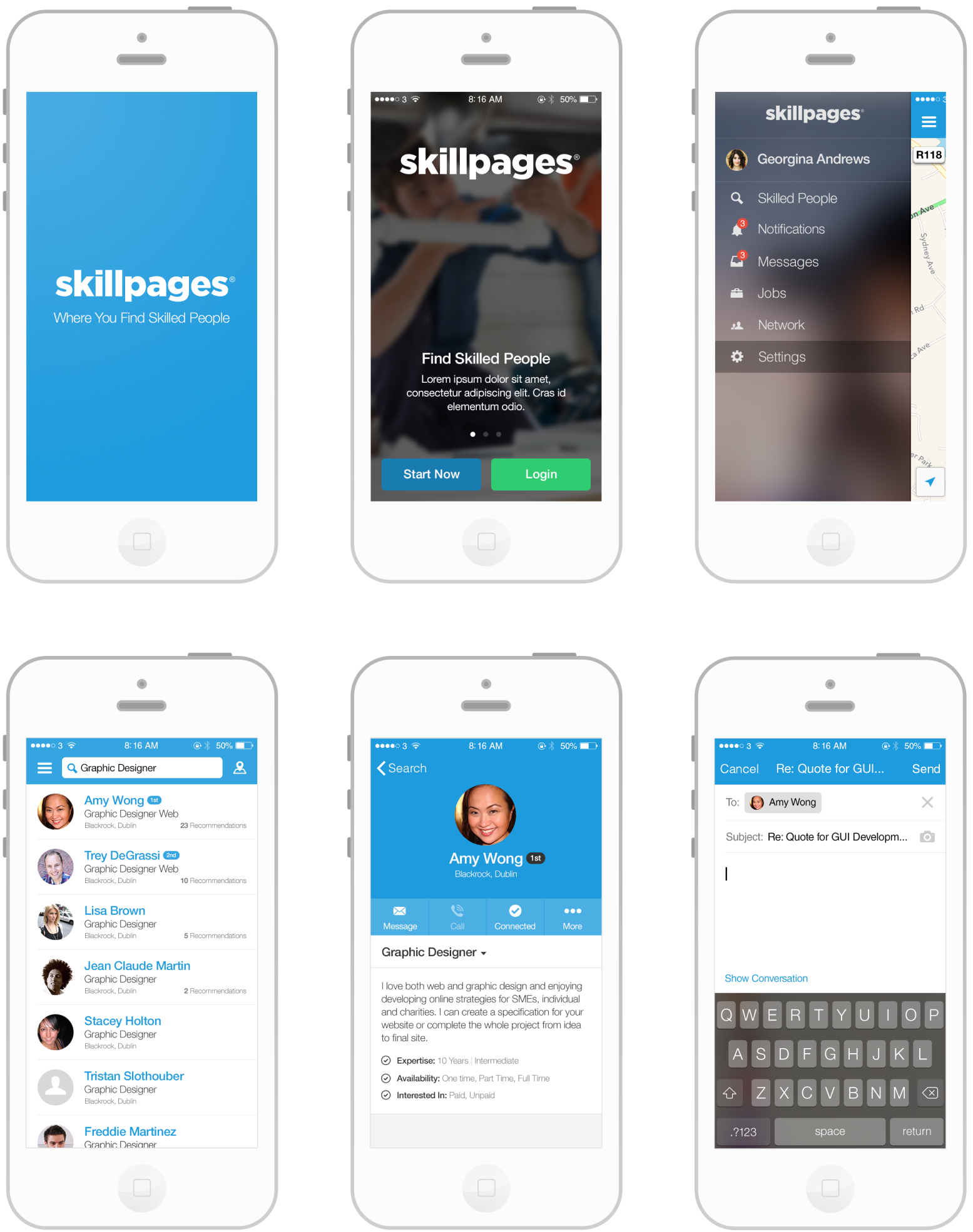
As well as having the desktop platform and mobile web, native mobile was a key part of the overhaul. Reiner Wendland took the lead on mobile and did some stellar work architecting a world class solution which was intuitive, design consistent and ahead of its time.
We learned through quantitative data, user testing and focus groups that there were some areas of the platform not performing as well as expected.
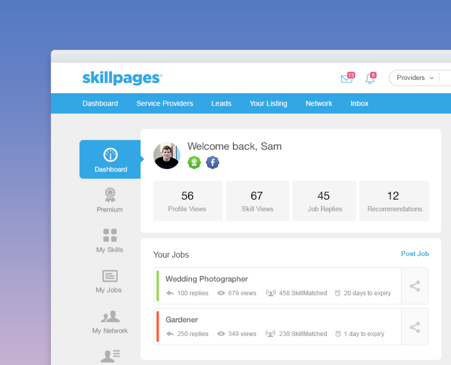
The feedback from users regarding the dashboard was very positive. We made notable improvements in terms of findability, presenting user information and statistics in an easily readable format, and ensuring that all major functionalities were just a click away. Despite these enhancements, the metric for returning users had seen some progress but not enough to meet our desired goals.
Recognising the importance of addressing this issue swiftly, we made a bold decision to transition from our existing static style of dashboard to a dynamic newsfeed format. In anticipation of this potential problem, we had already incorporated a streamlined version of a "Discovery Stream" in the initial version of the dashboard. The presence of this basic framework made it a little easier to gain buy-in when the time came to advocate for the new newsfeed-style dashboard, which marked a significant departure from the customary approach employed by SkillPages.
The inclusion of heatmaps played a crucial role in confirming that users were indeed eager to engage with the "Discovery Stream" feature. Building upon this insight, we leveraged the Discovery Stream as the foundation for an entirely revamped dashboard experience, resulting in the creation of a newsfeed that proved to be a tremendous success. This transformative change ultimately contributed to a remarkable increase in returning users, highlighting the positive impact of the new dashboard design on user engagement and retention.
In certain cases, it's more effective to enhance and refine an existing feature rather than completely reinventing it. SkillPages Search serves as a prime example of this. Initially, our research indicated that people preferred conducting business with individuals, prompting us to prioritise profile photos. Our intention was to create a more personalised search experience that also highlighted mutual connections. However, this approach ultimately proved unsuccessful. Users did not respond favorably, finding it challenging to make informed decisions based solely on profile photos and mutual connections. Our user research, analytics, and heatmaps confirmed that this implementation did not perform well.
Recognising the need for swift action, we swiftly shifted gears and reverted to a more conventional search pattern, aiming to continually improve upon it. Fortunately, we had designed and developed the default search results pattern in parallel with the new approach, allowing for a relatively smooth transition. While not ideal, the switch to the more standard search pattern proved to be a wise decision. It demonstrated better performance and proved to be more user-friendly, providing individuals with the necessary information to make informed decisions when exploring profiles.
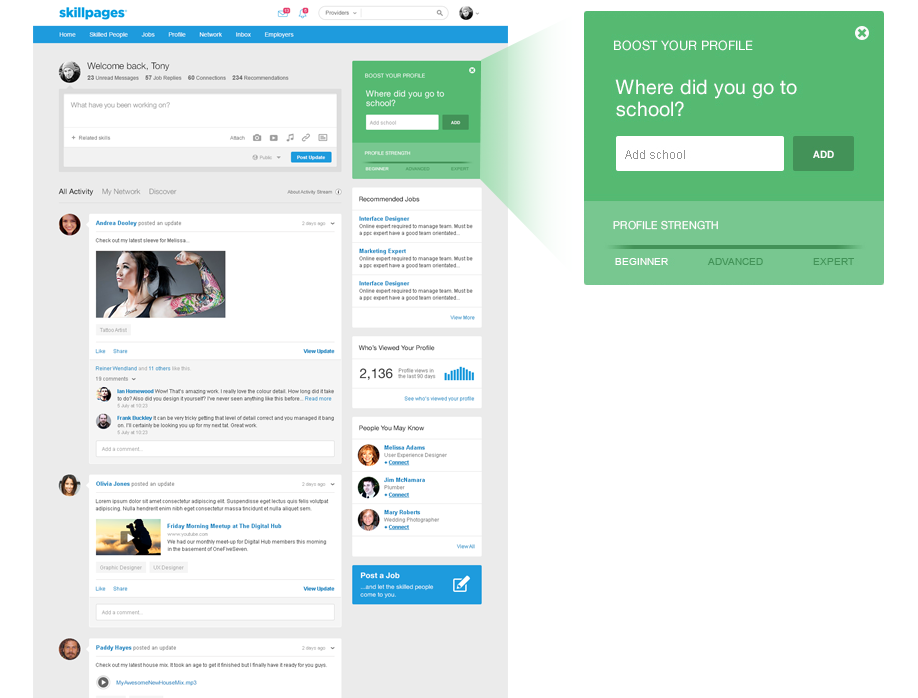
The Progressive User Engagement (P.U.G.) system was meticulously crafted to incentivise users to enrich their profiles and skills by adding essential personal data. Implemented at various touchpoints throughout the platform, the P.U.G. system enabled users to effortlessly contribute profile and skill content without disrupting their main journey. Gone were the days of navigating through multiple pages to add specific content - now, users could conveniently enhance their profiles without any hassle.
By encouraging better profile and skill completion, we aimed to enhance search results and deliver an improved overall search experience for individuals seeking skilled professionals on the platform. The P.U.G. system played a pivotal role in motivating users to provide key personal data, resulting in more comprehensive profiles and skill sets. This, in turn, significantly improved the search results, enabling a more efficient and targeted search process for users looking for talented individuals on the platform.
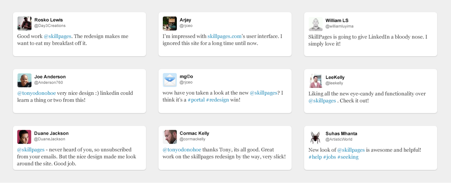
The new SkillPages platform was released in November 2012 and received positive worldwide feedback from members as well as turning heads in Silicon Valley. What the design team achieved in a relatively short space of time was due to many factors; communication, inherent agile ways of working but also the wider team effort. The design team had incredible support from the entire SkillPages team from the CEO right through to the engineers. SP2 was a showcase for what is possible when everyone is working together without politics and agendas but instead with a hunger and drive to deliver a world-class solution.
A dramatic increase in new user acquisition, user engagement and content generation followed which would see the social network grow from five million members to over 26 million. Previously, growth had been at a steady one million per year but after the release that number jumped to over seven million per year.